THE INTENTIONAL COMMUNITY
A Safe Space To Reimagine Sustainability And Wellness
Industry:
Non-Profit
Role:
Logo Redesign, Brand Guidelines, Web Design, Social Media Graphics
A Safe Space To Reimagine Sustainability And Wellness
Industry:
Non-Profit
Role:
Logo Redesign, Brand Guidelines, Web Design, Social Media Graphics
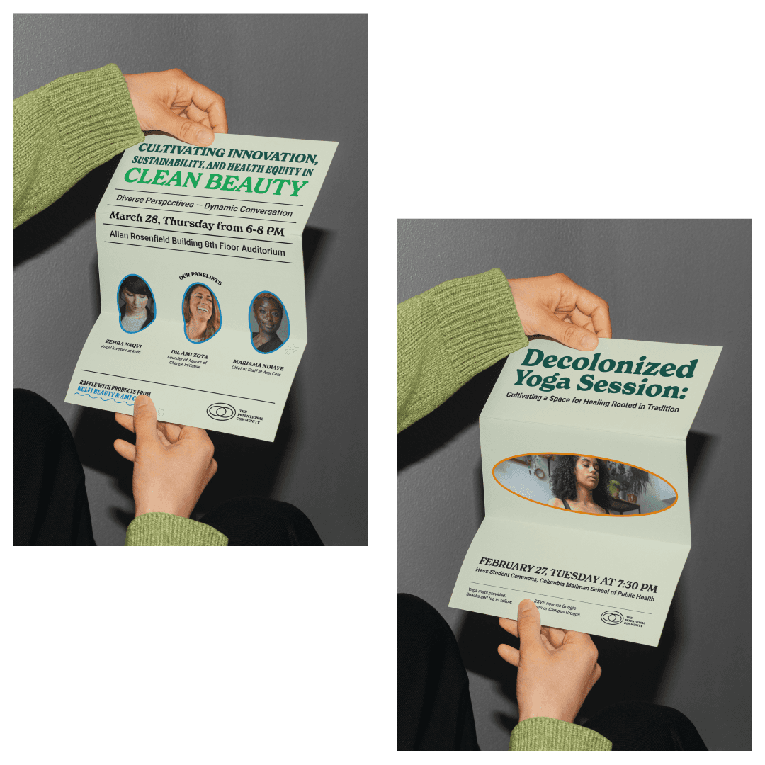
The Intentional Community offers a safe and courageous haven for reimagining sustainability and wellness in the heart of New York City. They champion the potency of supportive communities in nurturing positive growth. Through their thoughtfully curated events, centered on sustainability and wellness—such as yoga sessions, thrifting workshops, and mindful dining experiences—they seek to enrich lives and strengthen their community's connections to the planet. Celebrating the interconnection of human health and Earth's well-being, they strive to create positive change while having fun.
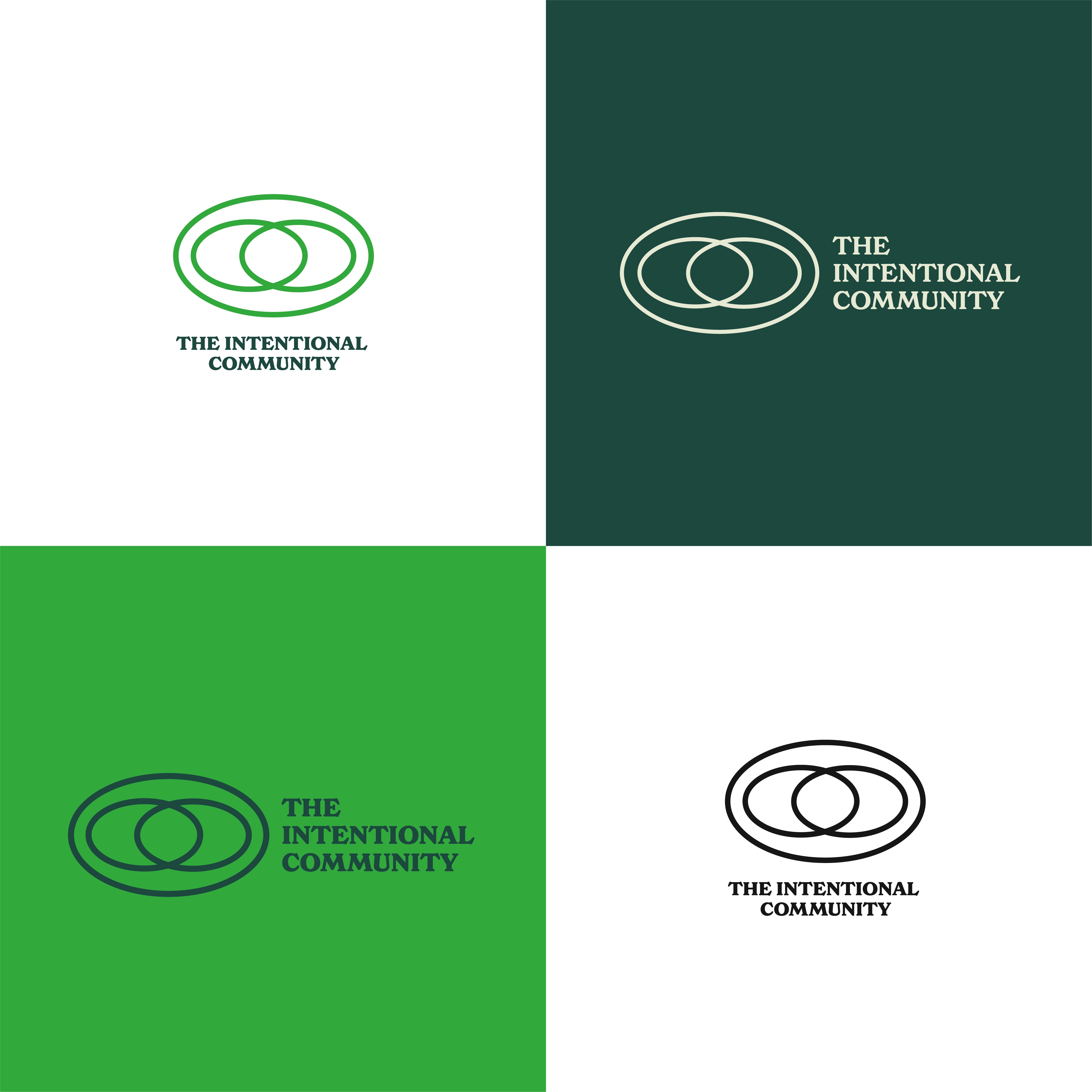
Having already conducted events that garnered some brand recognition and with the founders strongly attached to the distinctive ovals featured in the logo design, the objective was to refresh the identity to infuse a sense of novelty and excitement into something familiar.
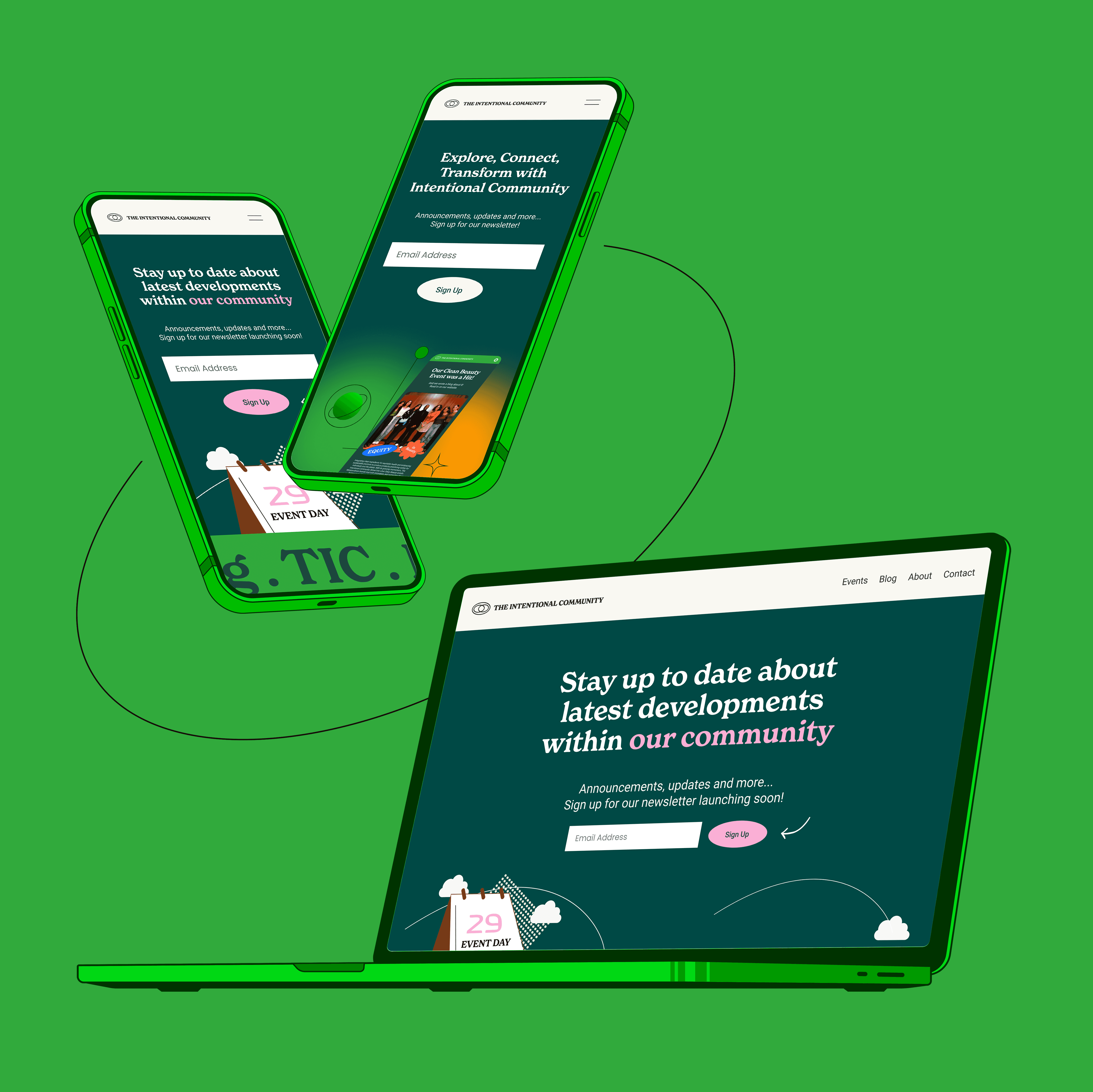
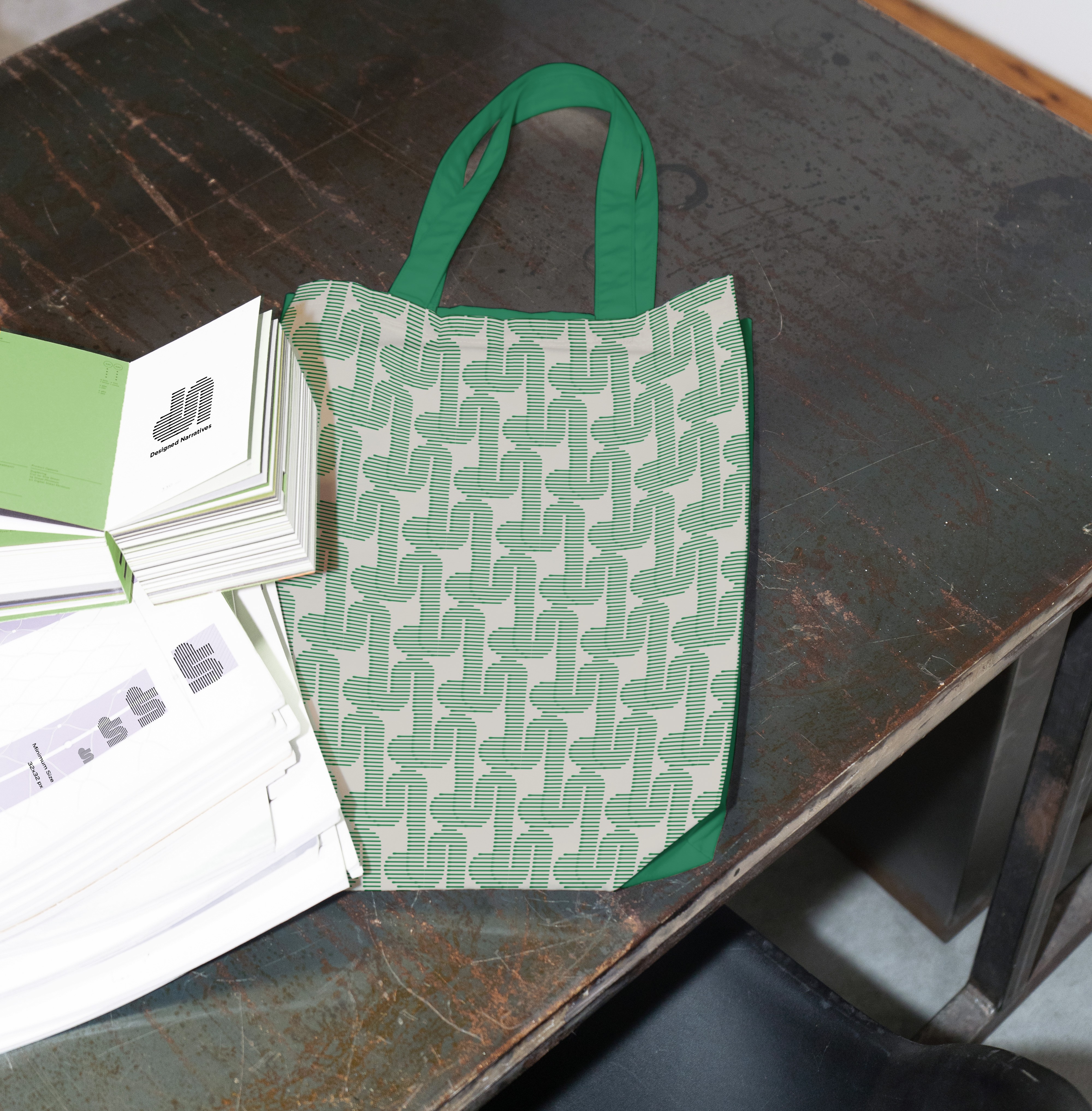
As part of the new brand identity, the ovals of the logo emerged as the central focal point, guiding the development of other elements such as brand shapes, illustrations, and placeholders for images. Utilizing multiple iterations of the oval shape enabled the establishment of a cohesive brand architecture, ensuring harmony and brand recognition.
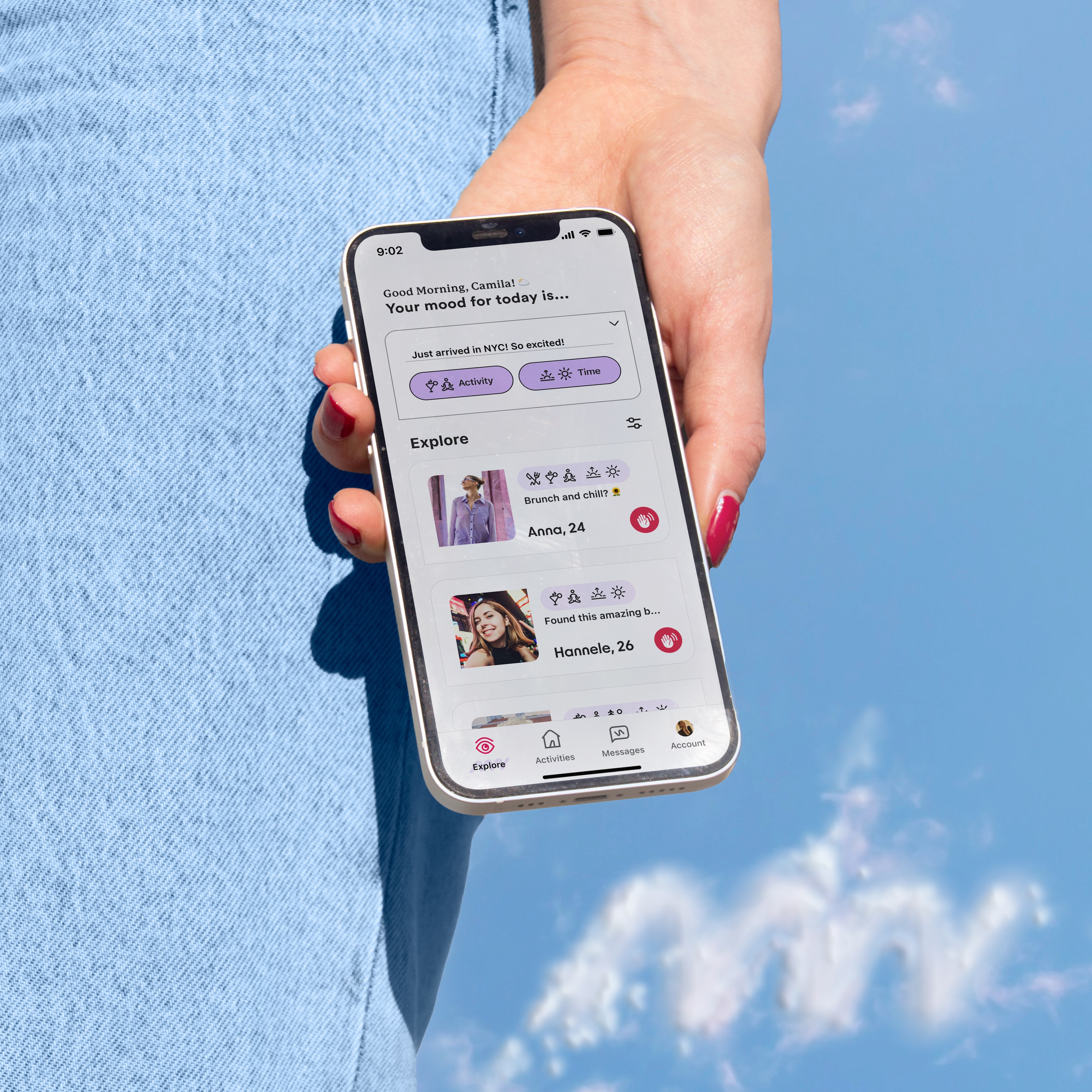
The next step involved simplifying the decorative typefaces previously used and integrating typography that conveys both the seriousness of the matter and the fun approach to achieving it. Additionally, the revitalization of the identity included infusing youthful energy into their subdued color palette and graphics. This process aimed to resonate with their target audience: passionate urban adults aged between 25 and 30, ensuring that the brand remains relevant and engaging to its demographic.
The new logo is a thoughtful progression of the original mark, retaining the ideas of community, wellness, and sustainability. Every detail has been meticulously considered: from refining the oval shapes, adjusting line thickness, and spacing to selecting a typeface that strikes the perfect balance between fluidity and structure. The result is a crafted logo that retains its integrity even when scaled down, guaranteeing readability and recognition across a multitude of mediums and applications. Contemporary, welcoming, and dynamic, the fresh identity radiates vibrancy and creativity through its graphic simplicity, making it a standout amidst New York's bustling visual scene and on social media platforms. Simultaneously, the system is designed to be highly functional and effortlessly executed, leveraging the versatile shapes derived from the oval elements.
Departing from the earthy muted tones of green and beige used previously in The Intentional Community's identity redesign introduces a refreshing change that aligns more closely with the community's values and goals. The new color palette fosters a stronger emotional connection with the audience. Brighter colors evoke feelings of positivity, optimism, and warmth, which are in line with the community's ethos of promoting well-being, sustainability, and positive transformations. The next change was made to the photography, where the colors in the photography used should always approximate include 60 percent primary colors of the brand, i.e., green, brown, or beige, to maintain cohesiveness. Cohesive photography helps tell a consistent brand story and reinforces the brand's messaging and values.