LA MÔME
French Bakery
Industry:
Food and Beverage
Role:
Packaging and Menu Design
Credits:
Logo Design by Joshua Chacko
French Bakery
Industry:
Food and Beverage
Role:
Packaging and Menu Design
Credits:
Logo Design by Joshua Chacko
La Mome is a French bakery that is starting its journey by setting up a cloud kitchen, and soon it plans to become a cozy spot in the heart of Mumbai's Bandra district. Originating from the culinary paradise of France, the chef and owner of La Mome, who is originally from France, strives to bring the true essence of French bakery culture to the busy streets of India. At La Mome, their goal is to create an unforgettable experience for their guests, with each bite being a mini vacation to Paris, with products as decadent as those served in a French home kitchen.
The task was to develop a packaging design that compliments the existing logo design and transports customers to an authentic French bakery experience, even while they're in India. The elements crafted for the box packaging design must be adaptable to create a cohesive menu design and versatile enough for future expansion plans, including other product packaging designs, as well as environmental graphics within the physical bakery.
They aim to immerse their customers in an authentic French journey—one known for its charm and relaxed atmosphere. It's an experience that wraps you in warmth, filled with enticing scents, intricate designs, and soothing melodies.
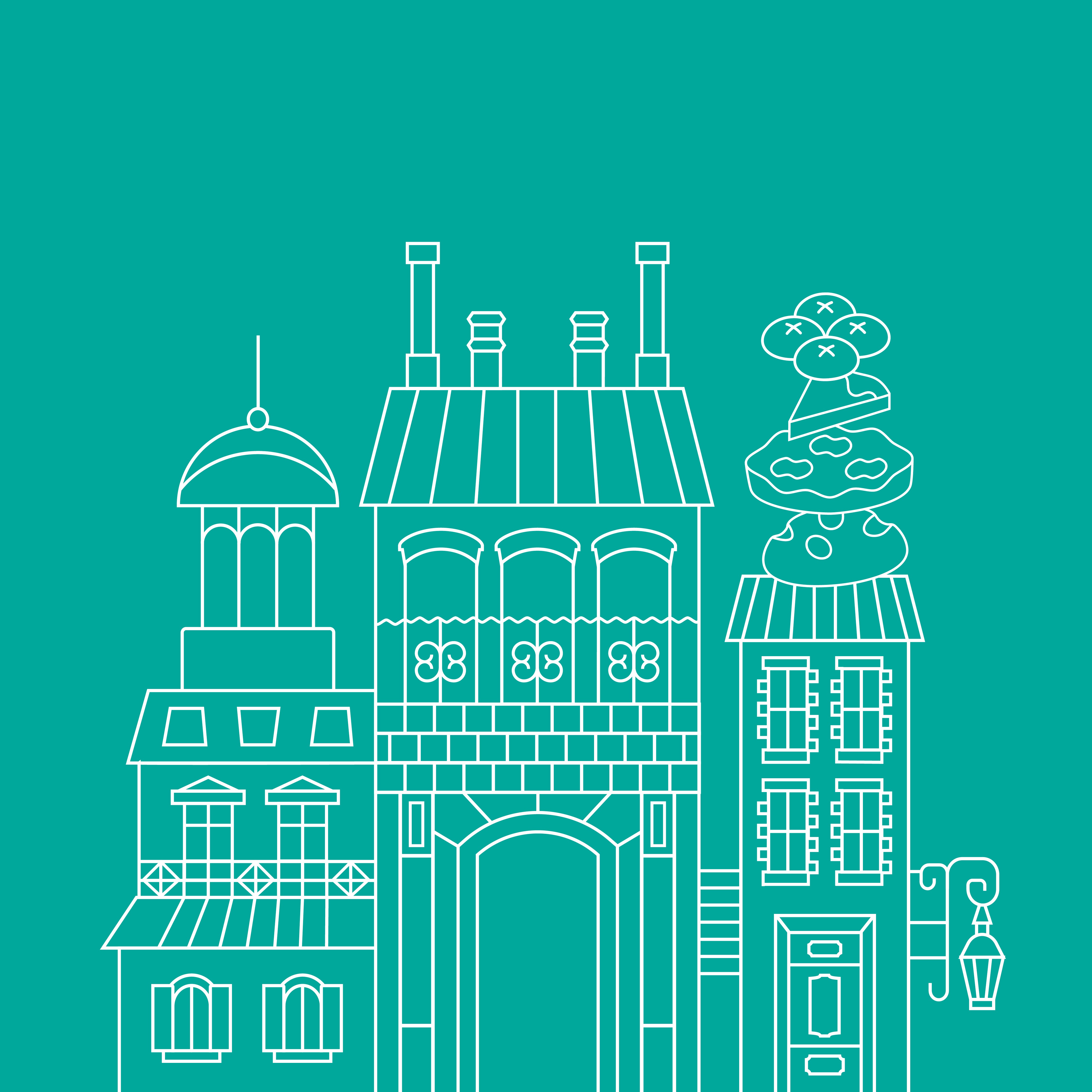
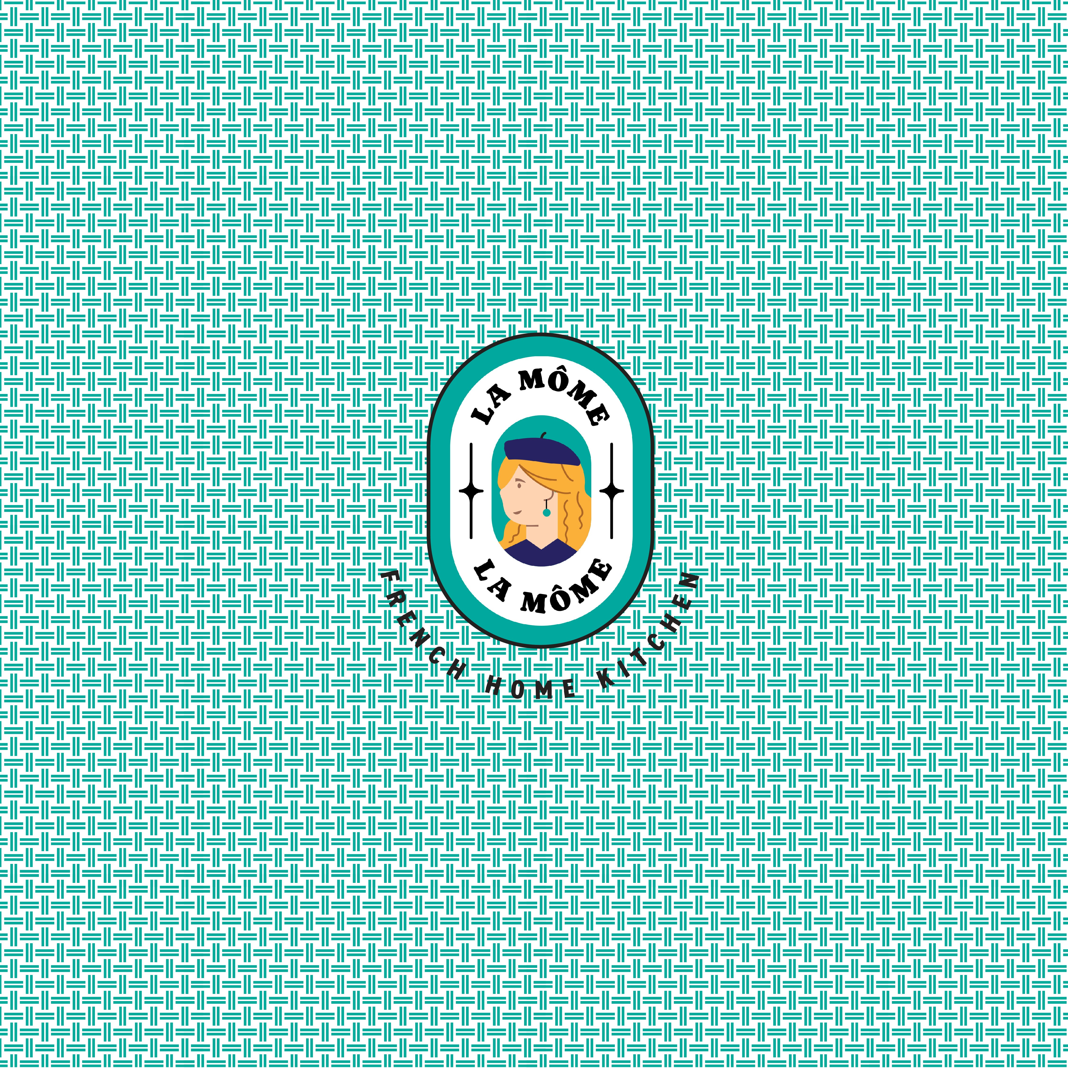
Stepping into a quintessential French bakery, you are welcomed by a sign adorning a traditional awning or canopy. Upon entry, the air is filled with the fragrances of flowers and freshly baked goods, accompanied by the gentle sound of music in the background. The sleeve of the packaging box mirrors this ambiance, adorned with the logo and illustrations depicting French architecture, floral motifs, bakery items, and a QR code seamlessly integrated into the artwork. This code grants access to a specially curated Spotify playlist, offering a melodic journey mirroring the ambiance of a French café. As you settle into an elegant woven bamboo chair, indulging in your chosen delights, the intricate pattern on the box echoes the timeless design of these iconic café chairs. Meanwhile, the butter paper beneath your treats features a mesmerizing repetition of mosaic tile patterns, reminiscent of the quaint flooring found in French bistros.
The detailed illustrations and the blend of diverse patterns gave the packaging an elegant touch. This intentional design was motivated by the desire to appeal to customers looking for authentic French culinary experiences and willing to opt for high-quality offerings.
Our goal was straightforward: to present the product as a premium treat. However, we also understood the significance of capturing the essence of French cafes, known for their lively ambiance and colorful decor. Thus, while maintaining a refined feel, we embraced the intricate detailing and lively energy commonly associated with these establishments. By incorporating elaborate designs and a variety of patterns into the packaging, we aimed to evoke a sense of sophistication, appealing to those with refined tastes. This approach not only fits well with the premium image of the product but also honors the dynamic culture and tradition of French cuisine.